A brand represents the perception an individual has of a company and the
feelings it evokes in them. That’s quite a mouthful as a description but it’s
even more complicated when you start delving into it. And for a luxury company
producing high quality designer jewellery, it’s something we absolutely had to
get right.
Everything we produce has gone through a rigorous design process, from conceptual ideas based on live trends and themes right through to a finalised piece. This is why we consider every piece to be timeless art, and our designer jewellery therefore makes our customers feel chic and beautiful. At the same time, our jewellery is both fashionable and on-trend, and so we wanted our brand to represent this.
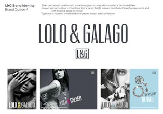
So- now to produce some basic concepts that walk the tightrope of highlighting our luxury positioning whilst having an artistic twist to show our fashionable nature. Our fantastic designer drew up several concepts from which we could take our favourite parts.
So how does a company create its brand? Where did we
start?
For us, a brand is fundamentally about creating a sense of style, beauty and timeless luxury which compliments all the treasures which we have inside our own ‘ pandora’s box’ of jewellery. We also wanted to determine the feelings our customers would experience when wearing a piece of our limited edition jewellery – true artistic pieces.
For us, a brand is fundamentally about creating a sense of style, beauty and timeless luxury which compliments all the treasures which we have inside our own ‘ pandora’s box’ of jewellery. We also wanted to determine the feelings our customers would experience when wearing a piece of our limited edition jewellery – true artistic pieces.
Everything we produce has gone through a rigorous design process, from conceptual ideas based on live trends and themes right through to a finalised piece. This is why we consider every piece to be timeless art, and our designer jewellery therefore makes our customers feel chic and beautiful. At the same time, our jewellery is both fashionable and on-trend, and so we wanted our brand to represent this.
So- now to produce some basic concepts that walk the tightrope of highlighting our luxury positioning whilst having an artistic twist to show our fashionable nature. Our fantastic designer drew up several concepts from which we could take our favourite parts.
We loved the idea of using a single, bold colour as a theme running
through our brand as we felt it represented the artistic nature of our
products, and combining this with bold, colourful photos and high contrast
black & white shots provided the perfect base for Lolo & Galago’s brand
theme.
So we’ve got a basic theme- the next step for any brand is to finalise
on the typeface. It is amazing how something as simple as font can have such a
huge impact on your brand’s appearance and perception. We eventually decided on
something mid-way between bolder, modern and edgy font and traditional ‘luxury’
font, which also proved a good way to draw the bold colour and imagery
together.
Finally, we needed to decide on our brand colour. We wanted something chic but unique, and a deep purple was the perfect way to express our luxury and artistic approach to design.
It’s hard work getting a brand right, but these are our first steps to create a beautiful and recognisable brand which reflects our luxury style and it can now be rolled out across our website and packaging.
All the images here are examples of our early designs and iterations, and you can see the finalised brand in every aspect of Lolo and Galago.


No comments:
Post a Comment